Packaging design refresh for an iconic OTC pain relief brand
Brand refresh and packaging system for Solpadeine
DesignChief worked in collaboration with Swan Design to deliver a complete packaging refresh for GlaxoSmithKline’s Solpadeine range. As Creative Director on the project, the brief was to evolve the identity of one of Ireland’s most recognisable over-the-counter (OTC) brands—enhancing shelf presence while maintaining strong consumer recognition and trust.
Modernising a Trusted Brand
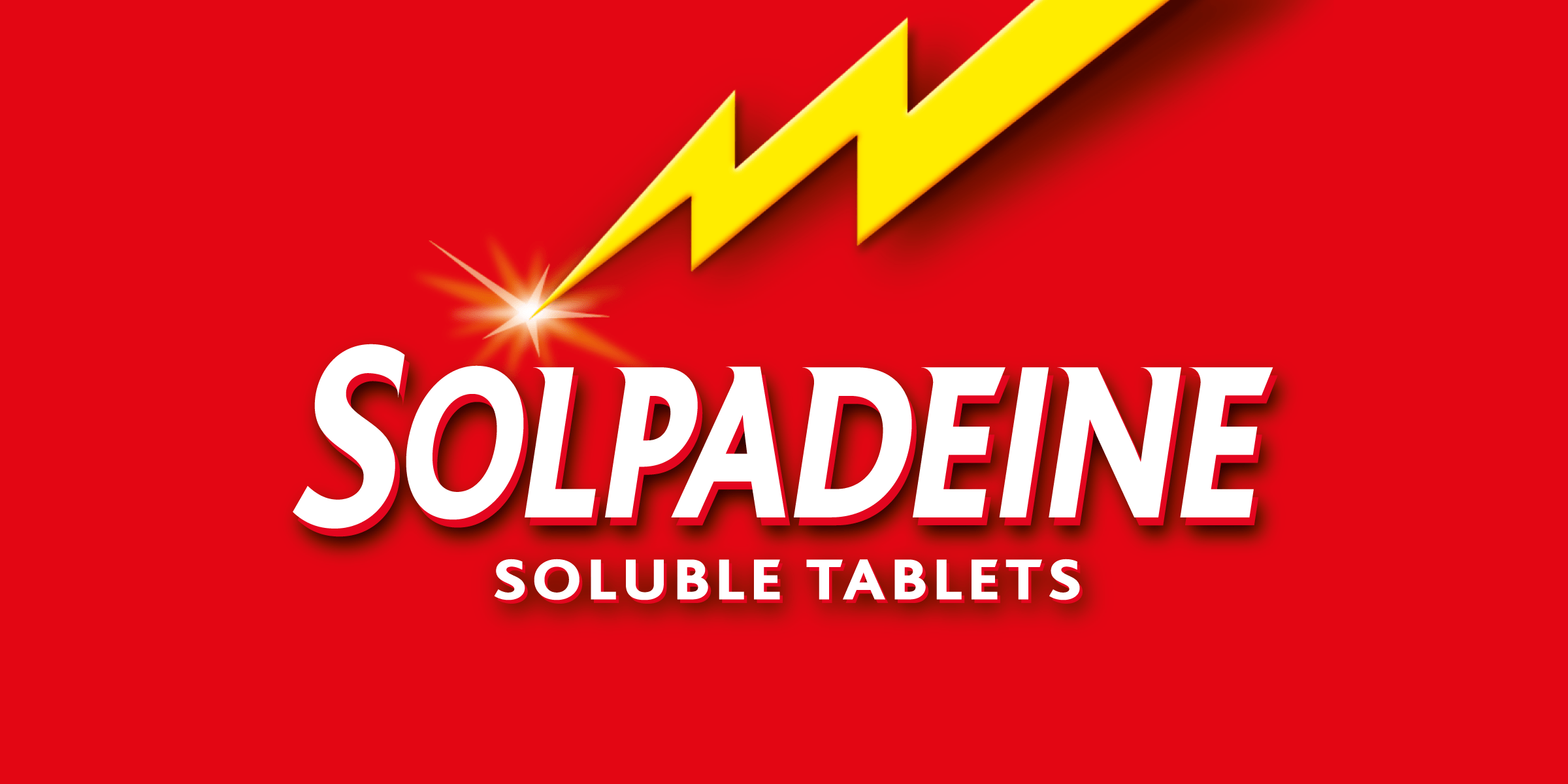
Solpadeine is a market-leading product with decades of brand equity. The challenge was to retain its visual DNA—most notably the signature red and yellow colour palette and lightning bolt—while improving legibility, consistency, and on-shelf performance across a broad product range.
The new design system introduced refined typography and a more dynamic spatial layout, improving clarity for dosage information and product type while retaining the brand’s bold energy. The lightning bolt was redrawn to improve balance and impact, becoming a more functional and ownable visual asset.
A System for Shelf and Screen
The refreshed packaging was developed as a flexible identity system to work across multiple formats, languages and pack sizes. Strong typographic hierarchy ensures key information is accessible and consistent at retail scale, while the bold visual style is designed to translate effectively in digital environments and pharmacy displays alike.
This refresh project for Solpadeine demonstrates how brand evolution—rooted in strategic design thinking—can deliver both commercial and visual clarity, while respecting the foundations of an iconic consumer brand.


